
Max Wardale-Seely
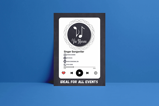
Vic Reeves - Singer Songwriter
For these designs, I was asked to create a simplistic logo that can be used as a profile picture for the client's social media page. I had to ensure the logo was versatile for different promotional materials and custom merchandise. As well as a logo, I designed:
-
A business card to promote the client's social media account and increase followers
-
A flyer that can be handed out during events and whilst busking to help reach a larger target audience
I wanted to create a logo that was simple, unique and music-related. I decided to use different musical notes to imitate the letters V and R (the clients initials) which clearly illustrates to the audience that the brand is related to music.
A5 Flyer Mock-up
Jennifer's Heaven Floristry

Final Logo design
A client approached me looking for new ways to expand and promote their business. They wanted me to redesign their logo and create a new business card. Their requirements were:
-
Professional look
-
Look high-end to promote the brand identity
-
Include email and phone number
-
The logo should connote to heaven
I considered these requirements and created a number of different logo styles and business cards templates until I was happy with the final version to be sent to the client. By experimenting with different fonts, layouts, colours, graphics it allowed me to improve the designs and ensure I deliver the best results. I feel that the logo and business card that I created gives a clear message, promotes the business, effectively captures viewer's attention and, most importantly, follows the client brief.
Relentless Judo
This client is my judo club, I run the club's social media page which has proved very successful, especially for attracting new members and increase website / social media profile visits. The club already had an established logo and colour scheme (red, white and black), and I decided that creating a web banner to brand all social media posts / stories would be an effective way to promote the club's values and provide the relevant information with ease. I created three visualisation diagrams which allowed me to experiment with different design decisions and justify why I made each design decisions. This graphic is now used by the club in the majority of their social media posts and it has created over 7.2k profiles visits in a month and over 500 followers meaning that it has been very successful.

Web Banner
1960's Advert

The aim of this graphic was to create a print media in the style of a 1960's advert for a modern-day product. 1960's adverts were known very regressive to be compared to today's standards, as they included bigoted views. I decided to create a poster promoting Red Bull, using a sexist theme (encouraging women to do more work around the house). I followed many common codes and conventions such as lots of written copy which address the audience and persuades them to buy the product.
BCM Flyer
The client asked me to create a flyer for their company 'Bexley Construction Management.' The aim of the flyer is to help increase the usage of their services and increase the number of clients that the business has. The flyer is bright and colourful which captures the viewer's attention as it is eye catching. The font used makes sure that the written copy is easy to read and understand.

Copy and Paste
Brief
For this project, I was given a brief to create a three minute video to promote a new TV show which will be broadcast on Channel 4. The brief allowed the video to be any style so I decided to choose a TV news interview for a new comedy TV show called 'Copy and Paste'. The requirements for this promotional video were: 1. At least two different filming locations 2. Appropriate framing of shots 3. Diegetic and non-diegetic sounds 4. Use of titles and graphics where appropriate 5. Use of appropriate mise-en-scene In addition they wanted us to create three print base media products promoting the new TV show. The three print medias have to follow a common visual style and at least one of the print base media has to be a billboard. The requirements for these print base media products are: 1. Three different adverts, each aiming to engage the audience/audiences as identified in the brief 2. Appropriate layout and design choices for each advert 3. A common visual style to the overall campaign creating a recognisable brand and visual identity for the product/issue 4. A distinct marketing strategy should be identifiable in each advert and across the campaign 5. At least three original images across the three adverts with a different dominant image in each advert 6. Images should be created and chosen to appeal to the target audience
Copy and Paste
Video Planning
Script:
The first step of my pre-production planning for the video was creating a script. This was used by the cast and me (the directors/producer) to keep track of what needs to be said and recorded. In addition the script enabled the actors know what my intentions/direction for the video.
Intro music and animation plays In the studio/ in front of green screen [Wide to mid panning shot of presenters talking] Laura Good morning this is channel 4 news and the time is 8.45. Top stories today. The Queen is rumoured to be alive and well in Mexico. M&S shop closures leads to 1000’s of jobs loses. And an exclusive interview with comedians Jack and Alex Walker over to Richard for more. Richard Have you ever been mistaken for someone else? Well comedians and identical twins Jack & Alex Walker have created a new comedy tv show called ‘Copy & Paste’ whose aim is to combat the identity issues that many twins face in their day to day life. Laura The comedians have followed their passions for comedy to help raise awareness about this issue that they have faced throughout their lives and they join us now for an exclusive interview talking about their new show releasing to Channel 4 at the end of this month. Zoom style shot of both the presenters and twins [Twins at home] Richard: Good morning to you both Jack Good Moring Alex Good Morning Richard So both of you have come together to create this new show called ‘Copy & Paste’ . What drove you to make it? And why did you pick to explore the theme identity? Just Jack and Alex on screen Jack Well my good friend Richard I can see you don't have your glasses on and if you can not tell there are two of us you aren't just seeing things. [All Laugh] Jack The thing that drove us to make this, is us growing up our whole life and people constantly getting us confused with each other, and even sometimes only thinking there is one of us. Alex We spend our whole lives having to deal with this so we want to raise awareness about these issues of identity, and also make them laugh at the same time, overall, putting a smile on peoples faces. Shot of both locations Laura So we are all good friends here, and even I sometimes make the mistake of calling you the wrong name. What is the worst or just most annoying situation where this took place? Jack Well this was not annoying but more funny and was all caused by Alex running for head student in secondary school. Shot of the show Alex Ah yeah, so I ran for headstudent in my first year of sixth form and Jack was in charge of being my campaign manager. He created posters, videos and stickers so everyone knew who I was but there was a major thing we didn't think of. Everyone thought Jack was me and kept coming up to him telling them they will vote for me for head student not knowing there's two of us. Jack It was a very chaotic time and we even fooled the Vice Principal that I was Alex and was the head student. All of them Laura Ah yes I remember you telling me this story when we first met. Richard I wish we could keep you longer but we are almost out of time, which I'm sad about as we love when both of you are on as you always manage to put a smile on our face. Even with the devastating news that is happening at the moment. But before you go is there anything you want to add? Just Alex & Jack Jack Thank you for having us and make sure you tune in to Channel 4 to watch our new comedy show ‘Copy and paste.’ Which is bound to put a smile on your face and help you forget about all your problems whilst you watch it. Alex Yes Thanks for having us, and if you are struggling remember I always take life with a grain of salt. And a slice of lemon. And a shot of tequila. [All Laugh] Cut away back to studio Laura They are always great to have on and make sure you tune in next month to see their new comedy Tv show ‘Copy & Paste.’ Which highlights the identity issues that many twins face. Richard This has been Channel 4 news and Thank you for watching, I have been Richard Murphy. Laura And I have been Laura Gibson Richard See you tomorrow Outro + Music
Storyboard:
I created a storyboard that allowed me to have a visual representation on how the final product may look. The storyboard allowed me to have different information such as the scene orders, timings and camera movements.


Copy and Paste
Final Video
Video call style TV interview promoting the new comedy TV show 'Copy and Paste'
Copy and Paste
Print Media

.png)
A magazine front cover promoting the new show
Large poster promoting the show

Billboard promoting the show
Behringer Campaign
Brief
I have been asked to work on the marketing team to design a cross-media marketing campaign for the company focused on their headphone products. The aim of the campaign is to raise consumer awareness of the product and to promote the idea that customers can experience better quality sound using Behringer products. The concept that listeners can experience ‘studio quality sound’ from their headphones is an idea that the company wish to promote. The objective of the campaign is to increase online sales of the product within the identified target market. The target market for this campaign is focused on the 18-34 market. The market is non-gender specific, but should focus on the mobile device (smartphone, tablet) users. Behringer have describe the target market of young adults as “Super-engaged with music and technology. They are junior athletes; they are artists; they are bloggers. They come from all walks of life”.
Behringer Campaign
Pre-production
This is a visualisation diagram that I created to help me with my design decisions. It explains the thought process of each element within my final design.
%20(4%20Oct%202021%20at%2011_23)_edited.jpg)
Behringer Campaign
Final Design
.jpg)

Web Banner
Small a4 Flyer
'I Stand For'
Campaign
For this graphic, I was asked to create an billboard advertainment to combat sexism and unite people together. Through some planning and careful consideration I came up with the name of the campaign 'I stand for' which highlights to people what different women stand for in society decided to do this through the use of photography by using powerful, emotion evoking images. This therefore captures the audiences attention and make them want to act due to an emotional connection being made.

Light to dark circle gradient

Gradient light to dark

Gradient dark to light
